I just really like this photo because of the diffrent shapes it has in it. It not that much of a difference when it comes to color but the diffrent shapes make it pop as a photo by it self.
You only have one b&w version of your photograph here, CiCi. What happened? The textures and lighting of this composition work well in b&w for sure, and it was a good choice. But there were supposed to be five versions.
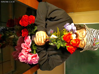
I wanted to create a reflection of flowers with students and the flowers represent everyones reflection of there own beauty. I went low toned with this one like a movie seen i wanted the flowers to pop more in color. I wanted this to also look like a drawing a little and you can still see the flowers reflecting at the bottom.
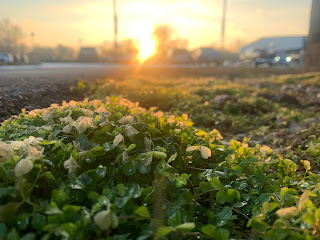
DOF Irish March In this photo I wanted to get the frost in the photo and to help some of the green to stand out just a little. This was tooken a little after golden hour around the school and it lined up prefectly with how everything went into focus In this one I tried to do the opposite of having the grass blurred out and the trees in focus. frezzing motion All of these were my freeze motion of the 1000 acre lake land. It was when I got off work and decided to visit. The water was very active this day and when the sun wasn't shining one day there was foam and i almost touched it until i found out what type of foam it was. What I was thinking was what better way to capture frozen motion then going to bodies of water.


You only have one b&w version of your photograph here, CiCi. What happened? The textures and lighting of this composition work well in b&w for sure, and it was a good choice. But there were supposed to be five versions.
ReplyDeleteThis photo had a lot of potential, but the effort wasn't there. Wish there was more.
ReplyDeleteReally like your photo, very dynamic textures with the ice vs the concrete. Maybe look out for the dodging and burning, there is strength is subtlety
ReplyDelete